UI glitch with narrow devices #896
Comments
|
I would like to try this one. Should the icon buttons stay in the panel? It looks like there is space for them once the text goes into an expanding menu. |
|
I'd say it wouldn't hurt to have them directly accessible and not hidden behind an additional burger menu if there is sufficient space |
|
How about the folder icons with no text next to them in the screenshot? Is that part of this issue? |
|
I think this is related. If I remember correctly, the actions (print, delete, edit) were added as breadcrumbs. My guess is, that they are hidden within the dropdown as a folder icon with no text. |
|
I am not able to reproduce this unless I make my viewport extremely small (243px). Before that, the recipe title is still visible, so there is no space for the buttons in the right. @christianlupus, May I ask what your resolution is when experiencing this issue?
Here is a video with different sizes Peek.2022-03-07.13-34.mp4There also seems to be a related problem around 5 seconds where one button goes out of the viewport to the right. Should I open a new issue for this or do you think that this has the same root cause? |

|
I can confirm the issue on my Samsung galaxy S9 which has a resolution of 2960 × 1440 but the logical resolution is obviously different. |
|
I think The problem with using this is that it makes a log of assumptions. For example, when collapsing, it assumes that the best folders to hide are the middle ones, leaving the root folder and deepest folder visible.Maybe I am wrong, but I don't see any way to control this. What does everyone think of re-implementing this ourselves? The styling would not be difficult, and we would have fine control on which buttons are hidden at which screen size. This would also give us the opportunity to remove the arrows between the action buttons, which in my opinion should not be there. |


|
The actions should definitely not be part of the breadcrumbs. I guess it was done as a quick 'n dirty workaround for getting some buttons up there. However! I would keep the breadcrumbs for indicating the structure, e.g. for categories
or for things like search
Who knows, there were at some point discussions about maintaining multiple cookbooks in the app, then we might want to have a Nextcloud-styled breadcrumbs bar The actions can be separated from the breadcrumbs container and added, e.g., floating to the right and might even be hidden in an
(Idk, why the reload icon for the recipe is overlapping with the text. Is it like this this just for me?) |


|
@seyfeb Thanks for your thorough response.
This also changed for me as well recently in my development instance. I'm not sure what would have changed it. Maybe a regression in |
|
This is what I have now: I put the action buttons on the right for now, but they could easily be moved to be left-aligned with everything else. The problem now is that the recipe name / reload button is never collapsing into the menu because the This becomes a problem around 400px. Peek.2022-03-09.11-53.mp4Sorry about the video. It's a little bit hard to tell the problem with the icon position bug that @seyfeb mentioned. Please notice the rounded corners working down to 400px, but then becoming square as the action buttons to the right take that space. |

|
I have the same issue with the reload button. Do you wish to solve the issue as a by-product or open a separate issue to keep track of it, @MarcelRobitaille? |
|
I don't think that is the same issue. I think the reload button might be a bug in |
|
I installed |
|
No, I meant that if you put the buttons in their own container, the reload button might be the best fitting there as well. That might solve the glitch with the overlapping icon as a byproduct. |
|
Oh I see, sorry. I think that could be this same issue then. |
|
I moved the reload button with the other action buttons. This is how it looks now.
Still waiting on nextcloud-libraries/nextcloud-vue#2541 to make it responsive. |

|
I think this should be fine. I never felt the need to use the reload button anyways. is there an actual need/ use case for this? 🤔 |
|
I am not sure. Maybe if you edit the recipe in a different tab? I agree that this button need not be so readily available. Maybe we could show a three-dot menu to the right of all of the buttons with only the reload button, and progressively move buttons from the bar into the expanding menu as the window width decreases. I think we could already do this without changes to @nextcloud/vue. We might have to duplicate some of the buttons in the DOM, though. What do you think? |
|
A hamburger menu with a single action doesn’t sound like a good idea. I think showing all buttons and going with your suggested approach with decreasing screen width: full button (with labels) > only icon buttons > 3-dot menu is (going to be) fine. I was only thinking loudly when asking if there is a use case for the reload button in case someone has a need |
|
At least for debugging it is useful. Having a button to abort the edits might be the alternative. This is something I am missing when navigating intuitively. But yes, I was not rejecting the idea to reduce the with in steps as @seyfeb summarized. I am more thinking to add all "action buttons" (save, reload, delete, edit, ...) in one location. |
|
It doesn't seem like that nextcloud-vue issue is going to get addressed anytime soon, so I decided to create my own Here is what I have so far: Peek.2022-06-08.02-50.mp4One issue I am facing is that there is an issue with the tooltips for the intermediate mode. I am not sure if anybody here knows how to fix that. I also have to fix the error that sometimes comes up when the click event is undefined. nextcloud-vue handle this by creating a new method that calls the only visible button if its click action exists. This is more difficult in our case because we have more than one action. Finally, there was a glitch in the video where the buttons got small even though there was plenty of space. I never noticed this until recording the video. I think it is just a css glitch. The code is still a work in progress. I have to clean some things up, figure out how to deal with importing things that aren't exported from nextcloud-vue, and reset my commits and create new ones with real messages. Nonetheless, my WIP code is here: https://github.com./MarcelRobitaille/cookbook/blob/896-ui-glitch-with-narrow-devices/src/components/ResponsiveActions.vue. I also had to add |
|
@MarcelRobitaille how much effort do you guess it will take until this might be running? I am thinking of the next release and if we should include this in the release or not. |
|
I was able to fix the tooltip issue. I just had to specify |
|
Do not worry about the timeline. Better having good code slowly but bad code that needs complete rewriting. I will have to take a closer look here. Will come back to you soon. |
@MarcelRobitaille really cool work! The reason there's no component for something like this is because we generally don't have a row of many buttons with text, it's usually one or two commonly used buttons :) You could also just use a row of icons without the text, and if the screen is still too small, use a 3 dot menu. Deck does something similar. I would suggest since the reload and delete actions are not used very often they can go into a 3 dot menu either way :) |

|
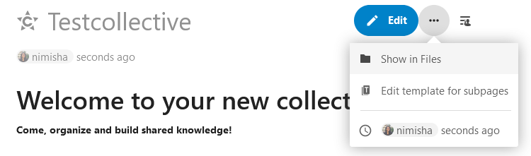
@nimishavijay Thanks for the comment. That's another way to do it. I must admit, it looks good in your screenshots. I like the blue primary button. I am open to this, but I wonder what the others think. I agree that for me, the most used button would be edit. |
|
I think the Edith button and the ...button look a little better. It doesn't look so cluttered. Still, I think your implementation is cool too. |
|
I made a quick implementation of @nimishavijay's proposal (thanks for the inspiration 😁). Peek.2022-07-23.03-07.mp4I think it looks really good. I like the idea of having one primary button and hiding the less common buttons to keep the UI clean and uncluttered. However, it looks like we may still need some responsiveness in this implementation. Especially when "Edit recipe" is visible, the "Save changes" button can overflow. We should consider changing this to icon-only and/or moving it to the overflow menu dynamically, but then we're back to https://github.com./MarcelRobitaille/cookbook/pull/new/896-primary-edit-button |
|
My comments on this: Maybe we can replace the texts For the responsiveness question: How about a CSS based solution?
Would you think that manageable? |
I thought about it, but then we would have a lot of translations to update, right? I will see what I can do for the responsiveness. That's a good idea |
Yes, there are many translations to be fixed. But this will come as time passes. It is not our primary motivation to keep the texts as stable as possible. Technical functionality has more importance. But the translations are made by a community themselves. Thanks for that. This is quite some work, but as the group is quite large that will not take very long. A few days or some weeks and everything should be translated. |
|
I went all the way and took out the breadcrumbs all together. Instead of having I took out the home button, but I think this is made redundant by the "Cookbook" button in the Nextcloud top bar or the "All recipes" button in the sidebar. I made the recipe title become truncated with ellipsis if there is not enough space. The result is that the same layout can be kept even with very narrow screens. This also fixes #281 Peek.2022-07-23.16-57.mp4There are still some translations to update Forgot to show it in the video but it works for category too:
|

|
That video looks really good! Wow! 🎉😎 I want to try that out tomorrow if you do not mind. But I think this is the cleanest solution i have seen in the app so far. |
|
Thanks! I pushed everything and created a draft PR so you can easily find my branch when you check it out. |
|
Well done! 👏 Just one thing to add: I think "Viewing Recipe" is a little redundant, since you most probably know that you are viewing a recipe and, if not, you can figure it out by the fact that there is the edit button. I think removing this might reduce clutter and look even cleaner. Just my opinion though and maybe sth to discuss separately. A second thing: I feel like the new element could use a little bit of white space at the bottom so its easier to visually separate it from the title. Those are very minor comments though 😅 |
|
Thanks @seyfeb.
By the same token, you should figure out that you are editing by the save button. I think it's better to always show the mode when applicable for consistency. I am willing to remove "Viewing recipe" though.
I added the maximum space by setting
Here is
How much space did you want between the two? |


Description
At least when viewing a recipe the navigation is not handling the options correctly.
Screenshots


If applicable, add screenshots to help explain your problem.
The reload, edit and print actions are obviously not visible on the narrow device.
Browser
Which browser are you using? Firefox
The text was updated successfully, but these errors were encountered: